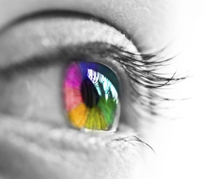
The Effect of Color Psychology in Design
There’s a reason transportation gurus around the world use the color red for stop signs. Not only does the brain see it immediately, but red has also been a longtime signal of “danger.” Likewise, yellow has always symbolized “caution.”  Apply that to a major brand like McDonald’s with its bright red background and glaring yellow arches—and, well, you get the picture. (Caution, go slow, danger!)
Since this isn’t a food blog, I’ll keep the culinary humor to a minimum. What I’m really trying to emphasize is the complexities of color psychology in logo design, or any design for that matter. Choosing colors for your brand is not as easy as randomly pointing to one on a color wheel. There’s a whole lot of thought that goes into it because not only do colors convey your brand’s personality and image, but they also trigger certain feelings in your customers.
Going back to the example of McDonald’s, red and yellow are brilliant choices. And they’re frequently used in the fast food industry. Studies on color psychology illustrate that the color red creates a sense of urgency, stimulates appetite and generates excitement, while yellow promotes optimism and is the one color that stands out in the bright daylight.
One study found that up to 90 percent of immediate decisions made about a brand is because of its colors. The response often hinges on the perceived appropriateness of the color “fitting” the product being sold.
What’s in a Color?
Below is a list of color associations that brands think about when considering their colors. Still, nearly all studies on colors and branding emphasize selecting colors that match the brand personality, rather than what the colors are associated with. Consider this for your next campaign or rebranding!
Red – Creates a sense of urgency, encourages appetite, raises heart rate, and is associated with movement, excitement and passion. (Example: Coca-Cola)
Blue – Provides a sense of security, curbs appetite and stimulates productivity. Preferred by men and conservative brands looking to convey trust. (Example: Lowe’s)
Green – Stimulates harmony in your brain and is associated with health, tranquility, power and nature. (Example: Whole Foods)
Purple – Fuels problem-solving and creativity and is associated with royalty, wisdom and respect. (Example: Hallmark)
Orange & Yellow – Promotes optimism and cheerfulness, and is used to create anxiety that can draw in impulsive buyers and window shoppers. (Examples: Nickelodeon and Best Buy)
Black – Conveys authority, stability, strength and is often used as a symbol of intelligence. (Example: New York Times)
Grey – Symbolizes feelings of practicality, old age and solidarity. (Example: Nintendo)
White – Expresses purity, simplicity, cleanliness and safety. (Example: Apple)
Best of Days to You,
Audrey Ferrante
Ferrante & Associates, Inc.
 Let’s connect
If you’d like to learn more about how we think here at Ferrante & Associates, subscribe to our blogs or our monthly Newsletter Ferrante Speaks. You may also follow us on Twitter, Google+ or Facebook.
Don’t miss out: Subscribe and receive regular updates delivered automatically via a web portal, newsreader or email.


